Print Ad Examples & Ideas From The 1960’s Advertisements
In the early years of the 1960s, the Americans were comfortably wrapped in post war complacency, not even suspecting the huge changes their country will go through in the coming decade. The nation’s innocence was timely shattered with the assassination of its promising young president, a growing racial divide, and escalating military action in Southeast Asia. It was like a new era began, a new youth culture emerged as more and more teenagers rebelled against conventions of the previous generation. This was new America, and fashion, sexuality, communal living, drug use, draft dodging and sit-ins were all elements of an increasing Generation Gap. Let’s take a plunge into 1960s advertisements and print ad examples and see how the industry has evolved over the years.
1960’s Advertisements & Print Ad Examples For Inspiration
1960s Concert Posters
Led Zeppelin Print Ad from the 1960s

Jimi Hendrix Poster 1969

Iconic figures such as Bob Dylan, Muhammad Ali, Jimi Hendrix, and Andy Warhol brought controversy and color to this tumultuous decade, while cultural events such as The Graduate, Stonewall March and The Monterey Pop Festival provided indelible images of a bellwether time in American society. Whether it was Beatlemania, bumper-stickers or bell-bottoms, the cultural contributions of the ’60s made it obvious that the times were certainly changing. The above iconic 1960’s advertisements for bands were what’s hip at that time.
Bob Dylan – Univ. of Mass. Concert Poster – 1964

In the 1960s, print advertising came to life. There were some big changes: art directors dropped line drawings, which were common in the 50s, and started using photographs. Photographs were considered more believable by people and copywriters and art directors were becoming much more inventive at getting their messages across.
In the ’60s, the advertising transformed into a more modern approach, in which creativity shined, creating unexpected messages that made the ads more appealing to the public’s eye. Let’s take for example the Volkswagen ad campaign, which featured headlines like “Think Small” or “Lemon” (used to describe the appearance of an automobile); this campaign ushered in the era of modern advertising by promoting a “unique selling proposition” or “position”, designed to associate each brand with a certain idea in the viewer’s mind.
This American advertising period was called the Creative Revolution, having as archetype William Bernbach, the man who helped create the revolutionary Volkswagen adverts, among others. Needless to say that some of the most creative and ageless American ads date from this period.
Check out: 15 Ads Inspired By Famous Paintings
Examples 1960’s Advertisements For Food & Beverages
Campbell’s Golden Mushroom Soup Collectible (1967)

As most of the food print ads from this period, this soup doesn’t really look so tasty. Notice the specific red colored type and the format of the ad: image at the top and text/description at the bottom of the print.
LifeSaver’s Five Flavor Assortment of Candy (1962)

This is a very colorful print ad, and it couldn’t be otherwise because it’s for fruity candy with 5 flavors.
Jell-o Just Picked Fruit Taste (1968)

The type treatment seams to jump in your eyes, right? Actually, your view focuses on the black text and afterwords on the image below. The text on the middle of the page is hardly noticeable.
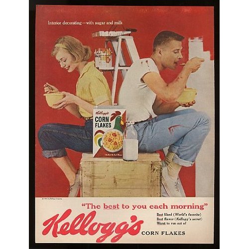
Again another print ad from Kellogg’s with lots of red on the background and the type treatment of the brand.
Coke Santa and Terrier (1961)

Now how can you deny that Coke had something to do with the “invention” of Santa? Just notice how the Coca Cola logo mildly changed since then.
Seven Up (1963)

This looks like a watercolor print ad and, as you can see, it has a large image on 3/4 of the print and copy at the bottom. Notice the label of the 7Up bottle, it’s so simple in graphics.
Check out: 10 Awesome Print Ads For Inspiration
1960s Alcohol Ads Example
Chivas Regal’s Blended Scotch Whisky (1963)

I just love the bottle, the label and the box of Chivas! It screams elegance and royalty. Notice the grungy background of the print.
Campari Aperitif Wine Space Bottle Rocket Art (1963)

On this Campari add, the main idea was to correlate the text with the image – “it’s just out of this world!”
Cinzano Vermouth ad from 1960

I very much like the watercolor drawings on the background of this Cinzano print ad.
Cigarettes/Tobacco 1960’s Advertisements
Winston – Bob Peak (1968)

This print ad from Winston combines the painted images with the cigarette pack in an artistic versus realistic sort of way.
Marlboro Cigarette Cowboy Horse (1969)

This is an all times favorite Marlboro ad. If anyone saw this photo without the cigarette pack, they would certainly think of Marlboro.
Winston (1966)

I personally find the bright yellow a little disturbing , but that’s just the way the print ads in those times used to combine colors like yellow, red and green.
Check out: Creative Elevator Ads
Beauty Print Ad Examples
1967 Max Factor Magazine Advertisement – “California Pink-A-Pades”

This print ad for Max Factor’s Pink-a-Pades looks very childish to me, maybe it’s because all the pink and yellow. But I guess it serves its purpose, to accentuate the idea of “pink”. Notice how graphics are combined with photo and the shades on the type.
1969 – “Pink is for Girls” Lustre Creme (USA)

I like the graphics on this print ad, although the size seems a little over exaggerated.
Channel No.22 Lady Flowers Perfume 60’s (1965)

A simple print ad for a famous perfume. It’s created based on a beautiful photo and black and gray type.
Dana Pullman Mens Cologne Train Photo (1967)

The type on this ad looks like one from the circus, but let’s admit that it is very bold for those days. The fragrance bottle looks roughly added to the image, doesn’t it?
Avon Print Ad (1962)

Wow, I didn’t even knew that Avon went so way back! Again we can see the red text on the ad and also on the products.
Max Factor Ultralucen (1969)

They tried to create a glow effect on this picture, but I guess their resources were limited. See how the large type is outlined and looks transparent.

I don’t think it’s ok to use underline in the title, but hey, it’s the ’60s, anything is possible!
1969 Magazine Advertisement – “The Can Bag” from Campbell’s Soup

The large type on the upper side of the print ad and the font used is specific to this period. I just love the type of the Campbell’s logo.
Check out: 12 Iconic Songs Vintage Posters
1960s Movie Posters Examples
The Good, the Bad and the Ugly (1966)

Lots of types in a variation of brown colors, so western, right?
Debbie Reynolds Unsinkable Molly Brown Movie (1964)

This print ad has such a playful design! I love the type treatment of the title, the colors and the illustrations.
Winning (Paul Newman, Joanne Woodward and Robert Wagner) (1969)

Wow, just check out this bright red! It certainly catches your eye! I like the sketchy look of this print, it looks like it’s out of a comic book.
“Hercules Unchained” (Steve Reeves) (1960)

This is really an outcome! Check out the 3d lettering and the cool illustration!
Royal Winnipeg Ballet Photos Trade (1961)

I’ve ran across a bunch of ballet posters 1960’s advertisements and they were all very monochrome.
Check out: 10 Stunning Movie Poster PSD Templates
Industrial Print Ad Examples From The 1960s
1964 Monroe Typing Machine Magazine Advertisement

I think this is the brightest red i’ve ever seen! I just can’t take my eyes off of this lady’s coat. I can’t deny the poster is both business and stylish.
1960’s Advertisements – Magazine Ad – Sony (USA)

They were so right! Sony has come a long way since then, but they are still in the top of the industry. This small television ad is so cute!
1965 Magazine Advertisement – Lightolier (USA)

This looks like a top notch design for a lamp! I like it!
Car and Motorcycle Ads from the 1960s
1966 Ford Fairlane Convertible (USA)

This print ad from Ford looks so retro! You can still see the rays on today’s illustrations or poster designs.
1964 – “Ugh” Volkswagen 2 (USA)

You can barely see the actual car in this print ad, but that’s just the idea of the guys who designed this print. I like the totem design, even if I don’t really see it’s point in the ad.

It seems like the colors of this ad have been seriously enhanced and they have an orange glow. I find the background a bit too dark, but I like the wheels!
Travel Print Ads from the 1960s
JAL Japan Airlines Hostess Eiffel Tower (1969)

Check out how the image of the Japanese woman fades and becomes transparent to give a surreal feel to the ad.
South Pacific Airlines “Unwind In Tahiti” (1961)

Oh, I would unwind in Tahiti today, not tomorrow! A simple concept, but notice that the whole ad is black and white and only the image on the clock of Tahiti is in color to enhance the beauty of the place.
Air France Pauper’s Guide Europe George Price (1969)

I like the comic-like graphics and the blossom-orange background on this print ad.
Home Deco Print Ads from the 1960s
1968 print ad: Ozite Carpet Tiles

Very suggestive image and great colors on this print ad. There is a lot of copy on the lower half of this print ad, it takes a while to read the whole thing! Otherwise, as usual: big title, simple fonts, big image and small copy at the end.
Which one of the 1960’s advertisements & print ad examples is your favorite? Let us know!
Like this post? Check out more amazing graphic design inspiration here.
The VW Ad seems like something they would do today with the new beetle.
It was so much fun looking through these! Thank you!
I’m so glad you liked them!
Hey interesting ads i like it thanks
the 60’s ad design have come back in 20’s….amazing ads
well well this brings back a few memories.
Hi,
I am creating a Static Website for a class that I am in. I was wondering if I could use a few of the logos used here including the kellogs and cigarettes logos?
Kaitlyn
I was suggested this website by my cousin. I am not sure whether this post is written by him as
no one else know such detailed about my problem.
You’re wonderful! Thanks!