Glossary for Design Beginners: 50+ Color Related Terms
As a newbie designer – whether you’ve graduated from design college or courses, or whether you’re self-taught – you’re constantly acquiring new skills and design resources. And because it’s the kind of thing you don’t usually find on the Internet, I thought I’d put together a small color glossary for you guys. After all, all things related to design lie on a foundation based on color. If you’re a design enthusiast you surely know what I’m talking about, but a list like this one becomes useful when you’ve forgotten a thing or two. So it might be a cool idea to bookmark or save it for further reference.
I’ve basically chosen over 50 essential terms you’re bound to use as a designer/artist. I’ve used professor Betty Edwards’ insightful book, Color. A Course in Mastering the Art of Mixing Colors and an art course, Introduction to Painting, which you can find here. The course also contains a useful drawing vocabulary you might want to take a look at.

Color Glossary
Achromatic – Literally, without color. In art, a composition in shades of black, white and gray.
Additive – Colors made by light; the additive primaries are red, green and yellow.
After-image – The illusion of a visual complementary color image that occurs after staring at a hue, then shifting the gaze to a plain white surface.
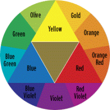
Analogous hues – Colors that lie next to each other on the color wheel.
Attributes of color – The three main descriptions or properties of colors, namely hue, value and intensity.
Balanced color – Colors that are balanced by their complements and varied across their values and intensities.
Binocular vision – Two retinal images, one from each eye, melted by the brain’s visual system into a single image that appears three-dimensional.
Chroma – The degree of purity or brilliance of a color.
Chromaticity – A term interchangeable with chroma, saturation and intensity.
Color constancy – The psychological tendency to see colors we expect to see even when the actual colors are different.
Color harmony – The pleasing result of balanced color relationships.

Color scheme – a set of colors chosen to combine within a composition.
Color wheel – A two-dimensional circular arrangement of colors that reveals color relationships of the spectral hues.
Complement, complementary – Colors that lie opposite each other on the color wheel. Placing them side by side enhances the brilliance of both; mixed together, they cancel the intensity of both.
Composition – The arrangement of shapes, spaces, lights, darks and colors within the format of an artwork.
Cool colors – Colors that connote the coolness of water, dusk and vegetation: usually violets, blues and greens.
Crosshatching – a method of shading by using short parallel lines, often in superimposed sets of lines crossed at various angles to darken an area.
Double complementary – A color combination of four hues: two sets of complements such as red/green and blue-violet/yellow-orange.
Dyad – A color scheme based on two colors.
Glaze (oil) / Wash (water media) – A transparent film of color painted over another color.
Grisaille – A method of painting that uses shades of gray in an underpainting to establish the value structure in a composition.
Hue – The name of a color.

Intensity – The brightness or dullness of a color; also called chroma, chromaticity and saturation.
Line – A narrow mark that defines the edges of spaces and shapes in a composition. Line can also be used for shading, as in crosshatching.
L-mode – The language mode of the brain, usually located in the brain’s left hemisphere and characterized as a verbal, analytic and sequential mode of thought.
Local color – The actual color seen on objects or persons.
Luminosity – In painting, the illusion of radiance or glow.
Monochromatic – In painting, a work based on variations of one color.
Monocular vision – By closing or covering one eye, the brain receives a single image, which appears to be flat like a photograph.
Negative spaces – In art, the shapes that surround the objects; sometimes considered background shapes.
Palette – A surface for holding pigments and providing space for mixing paints.
Perceptual color – The actual colors of objects and persons.
Pictorial color – The adjustments to perceptual color needed to bring a color composition into unity, balance and harmony.

Pigment – Dry color ground to a fine powder and mixed with a liquid for use as a painting medium.
Primary colors – Colors that cannot be mixed from any other colors—for example, red, yellow and blue.
Reflected color – Color reflected from one surface to another.
R-mode – The visual mode of the brain usually located in the brain’s right hemisphere and characterized as a visual, perceptual and global mode of thought.
Saturation – A term signifying the brightness or dullness of a color: used interchangeably with intensity, chroma and chromaticity.
Scumble – A technique similar to glazing, except that the coating is opaque and is just painted on very thinly to allow bits of the paint below to shine through
Secondary Colors – Colors that are mixtures of two primaries—for example, mixing yellow and red (theoretically) makes orange.
Shade, shading – In Ostwald’s model, color changes made by adding black, thus decreasing the proportion of the original color.
Simultaneous contrast – The effect of one color on an adjacent color.
Spectrum, spectral hues – The sequence of colors seen in a rainbow or in the colors created by passing light through a prism.

Style – An artist’s personal, usually recognizable, manner of working with images and art materials.
Subtractive color – Pigments and pigment mixtures used in painting that absorb all wavelengths except those of the color or colors apparent to the eye.
Successive contrast – Interchangeable with after-image.
Tertiary colors – Colors made by mixing a primary and its adjacent secondary—for example, the tertiary yellow-orange results from mixing the primary yellow and the secondary orange.
Tetrad – A color scheme based on four hues equidistant on the color wheel—for example, green, yellow-orange, red, and blue-violet.
Tint – A light value of the color.
Toned ground – A thin wash of a neutral color on a surface to prepare it for painting.
Triad – A color scheme based on three colors equally spaced from each other on the color wheel—for example, yellow, red, and blue.
Underpainting – A preliminary toning of the surface to be painted, often somewhat more detailed than a toned ground.
Unity – The ruling principle of art and design, which all parts of an artwork contribute to the harmonious unity of the whole.
Value – The degree of lightness or darkness of a color.
Warm colors – Colors associated with heat or fire, such as red, orange, and yellow.

Are there any other terms that you would add to this glossary?
I love the graphics!
Inspirational. Just what I needed to construct my very own personal color palette for my design work.