The Complete Guide To Typography In 21 Stunning Illustrations
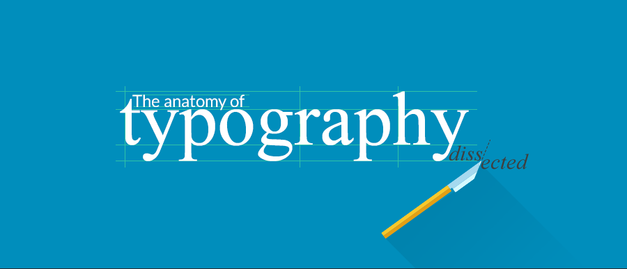
Typography has become the number one feature of your work that grabs the attention of your readers or customers if chosen correctly. Whether you are a designer or a publisher, knowing the terminology of Typography will definitely come in handy. It may look boring at first sight, but if you give it a chance, you might actually end up discovering new ways to attain perfection in your works. Besides the fact that your vocabulary will astound your peers from now on, this guide is your golden ticket to the professionals’ club!
And thanks to our colleague, Doink, your learning experience will definitely prove to be an enjoyable one. So let’s plunge into these 21 spellbinding illustrations and learn the secrets of Typography.
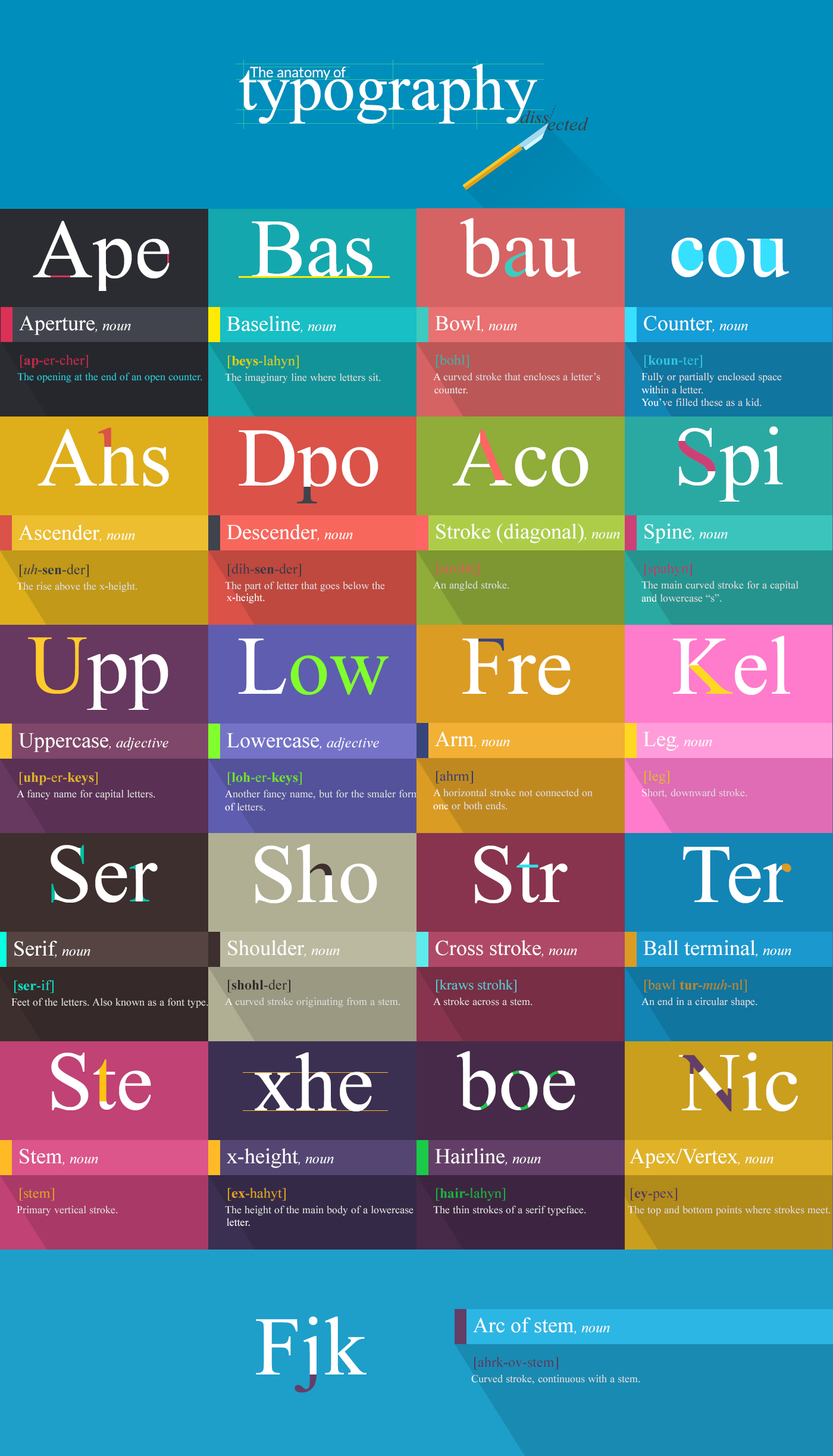
1. Aperture
[pixel77_caption type=”1″ src=”https://pixel77.com/wp-content/uploads/2015/10/font-anatomy-2-by-inkydeals.png” width=”900″]
The opening at the end of an open counter.
2. Baseline
[pixel77_caption type=”1″ src=”https://pixel77.com/wp-content/uploads/2015/10/font-anatomy-3-by-inkydeals.png” width=”900″]
As the legendary Les Claypool puts it – “the baseline is the line upon which most letters “sit” and below which descenders extend. The vertical distance of the baselines of consecutive lines in a paragraph is also known as line height or leading, although the latter can also refer to the baseline distance minus the font size.
North Indian scripts have a characteristic hanging baseline; the letters are aligned to the top of the writing line, marked by an overbar, with diacritics extending above the baseline. East Asian scripts have no baseline; each glyph sits in a square box, with neither ascenders nor descenders. When mixed with scripts with a low baseline, East Asian characters should be set so that the bottom of the character is between the baseline and the descender height. “
3. Ascender
[pixel77_caption type=”1″ src=”https://pixel77.com/wp-content/uploads/2015/10/font-anatomy-4-by-inkydeals.png” width=”900″]
Well, the ascender, in typography, expresses the mean line of a font. It makes the font more recognizable, more “warm” if you choose to put it like that.
4. Descender
[pixel77_caption type=”1″ src=”https://pixel77.com/wp-content/uploads/2015/10/font-anatomy-5-by-inkydeals.png” width=”900″]
As opposed to the ascender, the descender is that part of the letter that goes below the x-height.
5. Uppercase
[pixel77_caption type=”1″ src=”https://pixel77.com/wp-content/uploads/2015/10/font-anatomy-6-by-inkydeals.png” width=”900″]
Just a fancy name for the capital letters.
6. Lowercase
[pixel77_caption type=”1″ src=”https://pixel77.com/wp-content/uploads/2015/10/font-anatomy-7-by-inkydeals.png” width=”900″]
Another fancy name, but for the smaller form of letters.
7. Serif
[pixel77_caption type=”1″ src=”https://pixel77.com/wp-content/uploads/2015/10/font-anatomy-8-by-inkydeals.png” width=”900″]
Serif represents the feet of the letters. Also known as a font type.
8. Shoulder
[pixel77_caption type=”1″ src=”https://pixel77.com/wp-content/uploads/2015/10/font-anatomy-9-by-inkydeals.png” width=”900″]
A curved stroke originating from a stem.
9. Stem
[pixel77_caption type=”1″ src=”https://pixel77.com/wp-content/uploads/2015/10/font-anatomy-10-by-inkydeals.png” width=”900″]
Nothing more than the primary vertical stroke.
10. X-height
[pixel77_caption type=”1″ src=”https://pixel77.com/wp-content/uploads/2015/10/font-anatomy-11-by-inkydeals.png” width=”900″]
The height of the main body of a lowercase letter.
11. Bowl
[pixel77_caption type=”1″ src=”https://pixel77.com/wp-content/uploads/2015/10/font-anatomy-12-by-inkydeals.png” width=”900″]
A curved stroke that encloses a letter’s counter.
12. Counter
[pixel77_caption type=”1″ src=”https://pixel77.com/wp-content/uploads/2015/10/font-anatomy-13-by-inkydeals.png” width=”900″]
Fully or partially enclosed space within a letter. These space stirred your imagination as a kid.
13. Stroke (diagonal)
[pixel77_caption type=”1″ src=”https://pixel77.com/wp-content/uploads/2015/10/font-anatomy-14-by-inkydeals.png” width=”900″]
An angled stroke.
14. Spine
[pixel77_caption type=”1″ src=”https://pixel77.com/wp-content/uploads/2015/10/font-anatomy-15-by-inkydeals.png” width=”900″]
The main curved stroke for a capital and lowercase “s”.
15. Arm
[pixel77_caption type=”1″ src=”https://pixel77.com/wp-content/uploads/2015/10/font-anatomy-16-by-inkydeals.png” width=”900″]
A horizontal stroke not connected on one or both ends.
16. Leg
[pixel77_caption type=”1″ src=”https://pixel77.com/wp-content/uploads/2015/10/font-anatomy-17-by-inkydeals.png” width=”900″]
Short, downward stroke.
17. Cross stroke
[pixel77_caption type=”1″ src=”https://pixel77.com/wp-content/uploads/2015/10/font-anatomy-18-by-inkydeals.png” width=”900″]
A stroke across a stem.
18. Ball terminal
[pixel77_caption type=”1″ src=”https://pixel77.com/wp-content/uploads/2015/10/font-anatomy-19-by-inkydeals.png” width=”900″]
An end in a circular shape.
19. Hairline
[pixel77_caption type=”1″ src=”https://pixel77.com/wp-content/uploads/2015/10/font-anatomy-20-by-inkydeals.png” width=”900″]
The thin strokes of a serif typeface.
20. Apex/Vertex
[pixel77_caption type=”1″ src=”https://pixel77.com/wp-content/uploads/2015/10/font-anatomy-21-by-inkydeals.png” width=”900″]
The top and bottom points where strokes meet.
21. Arc of stem
[pixel77_caption type=”1″ src=”https://pixel77.com/wp-content/uploads/2015/10/font-anatomy-22-by-inkydeals.png” width=”900″]
Curved stroke, continuous with a stem.
This is where your journey ends! Hope this guide proved to be useful to you and now you can fully master the fascinating art of Typography. Don’t forget to leave your impressions in the comment section bellow!
Editor’s Note: This post was originally published in September 2015 and has been completely revamped and updated for accuracy and comprehensiveness.
Thanks Elena (and Doink). This was really useful information and well presented.
Really nice Typography here and wonderful and helpful tips for illustrations
Is the full infographic (as seen at the top) available anywhere that can be shared at a larger size? I would love to share it with my design students, it is really great!
I would like a high res file too. How many shims?
For the record:
Uppercase, from upper drawer.
Lowercase, from lower drawer.
As they was accommodated in typograph drawers.
Anyway, anything made for typography case is a good thing.
Nice job.
I am with Stephenie, can i get this in a higher resolution graphic. I would love to print it and have it on my wall.
Your guide line is help me in my professional life. Thanks for sharing……………
Hello. Do you have this image in hi-res??? I loved it!
would love a hi res file of this as well…:)
Hey guys,
My colleague managed to edit the post and provide higher resolution images. They are 900 pixels wide since they were designed for the web and not print. It should at least be enough for school presentations and such.
Good luck with your projects!
Thanks very much Claudia! :)
I would gladly pay for a high rez version of this poster and/or a nice poster. Please let me know.
Nick
I would really like to have the high res version of this too, where can I get it? please advice
Thanks very much !
I was taught this at Uni. Its been a while and i had forgotten a lot of these but thank you for the post its so nostalgic
If E’s and F’s have arms, and T’s have cross strokes, what do H’s have?
OK, did everyone miss the awesome Primus reference in Baseline (2) ?
It is nice overview. It gives me more attention on the design of any Typography
Typography is like Love, it is complex, it is beautiful.
THANKS FOR INSPIRING POST…WHERE IS .PDF FOR DOWNLOAD? If possible pl. send pdf at my email add.
I am really so inspired by your lovely post. Thanks a lot for the helpful sharing
Nice blog, get the latest website designing and development services for your business. Also get the Digital Narketing Services like SEO, PPC etc.
I really appreciate reading such kinds of blogs. Thanks for sharing such informative articles.
Your guide line is help me in my professional life. Thanks for sharing.