Avoid These 10 Overused Design Elements
“Designing is a matter of concentration. You go deep into what you want to do. It’s about intensive research, really. The concentration is warm and intimate and like the fire inside the earth – intense but not distorted. You can go to a place, really feel it in your heart. It’s actually a beautiful feeling.”
– Peter Zumthor
Design is constantly changing, and that is why your job as a designer is nowhere near as easy as some people may think.
When we say design, we mean every kind of design. From graphic design, web design, and user interface design, all the way the pret-a-porters or haute coutures of fashion design’s catwalks, each have to blend aesthetic and practical into a something that either promotes the product, or is, in fact, the product itself.
Today, however, we will be focusing on graphic and web design.
The rapid change of trends in design is the reason why, if you put a screenshot of a website two, maybe three years ago, and now, it feels like looking at an old daguerreotype of your great-grandmother on her wedding day, sometime before the Franco-Prussian War.
What they also are is a shortcut to making your designs look modern. But mindless design shows no matter how many popular elements your cross of a checklist, all the more so when trends go out of fashion (you can check out our article about this year’s hot trends if you want to see a few stable ones).
So we thought we might embark on a quick expedition, and see what people had to say about overused design elements in the past, and a little bit in the present.
We will be quoting from several articles, and we will, of course, be providing the links so you can check them out in their entirety for yourselves.
First up, we have Shayla Ebsen’s article for DesignerPunch.
1. Reflective Objects
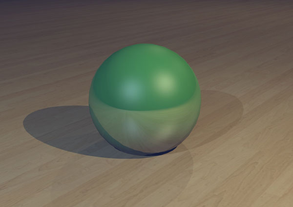
“When first arrived on the design scene, reflective objects conveyed messages of modernity, sleekness and professionalism. However, after being used on everything from soft drink advertisements to the latest tech gadget promo, the use of reflective objects has become anything but modern or original.”
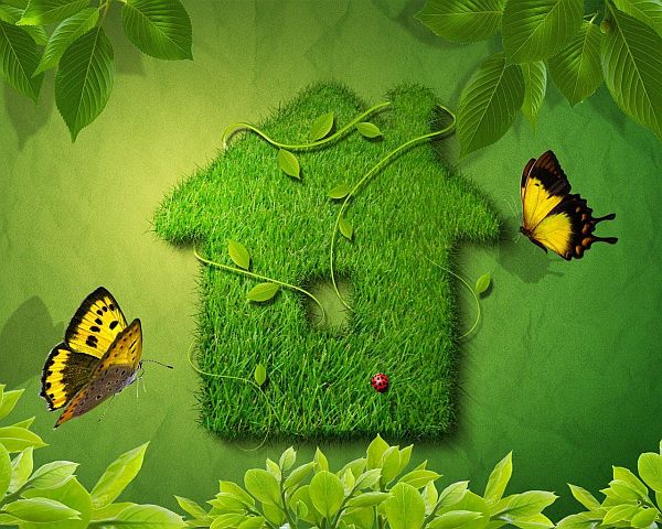
2. Green
“While it’s now more important than ever for many businesses to portray environmentally friendly images, this concept is becoming extremely overused in design projects. Avoid the excessive use of green tones and such graphics as trees and grass. Using these elements will simply lump you in with designers using concepts that are no longer innovative.”
Now we give you a few items off of Joshua Johnson’s article on Design Shack.
3. Web 2.0 Gloss

“The problem is of course that stylistically, designers have largely dropped this and are moving once again towards more subtle choices. Implementing a heavily glossed web 2.0 style on your site is a surefire way to make a brand new site seem like it’s already due for a design refresh.”
4. The Burst

“My main problem with this is that it reflects a complete lack of thought and imagination. Instead of considering how to effectively integrate a logical and appropriate break into the design pattern, the designers who use this simply use the very first idea that pops into their heads. It would also be the very first idea of every non-designer as well, making it the most uncreative design element you could possibly use.”
Next up is an article from Jacob Cass’ own website, JustCreative.
5. Ink Splatter
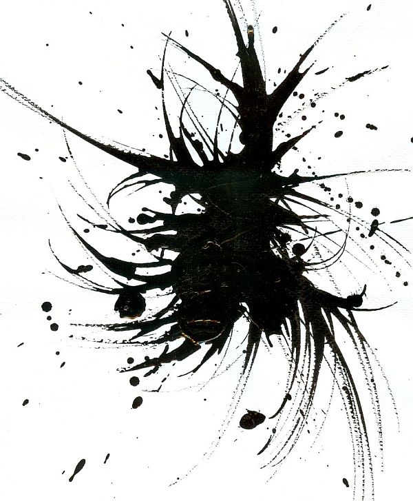
“Ink Splatters do add a cool/trendy look to a design and they do blend well with grunge style designs however ink splatters should be used in moderation.”
6. Black (or Coloured) Silhouettes
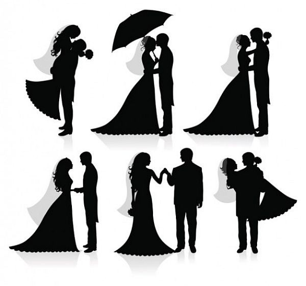
“Vectorised silhouettes of people and other objects is definitely second on the list. Made famous by the iPod campaign this technique can now be seen everywhere. Notice the combination of the sun rays and black silhouettes.”
Lastly, we have a few recent overused elements, taken from Ali Qayyum’s excellent article on Smashing Hub.
7. Image Sliders and Carousels
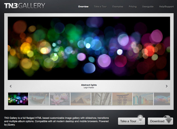
“It not only does it make a website look professional, giving a central focus, it has the advantage of displaying a multitude of hidden content , giving it equal importance which one would not be able to display all at once.”
8. Minimizing Anything Above the Fold
“Doing this on any landing page of a website is recommended by many designers so that as much can be seen without users needing to scroll. This may be the case unless you have a specific audience who are already trained to scroll down a page to look for specific information such as results of some sort.”
9. Circular Avatar or Profile Pictures

“It may be over-used but they look modern and instinctively more appealing to view with the human eye, according to many designers.”
10. Screenshots or Mock-ups Shown with Perspective
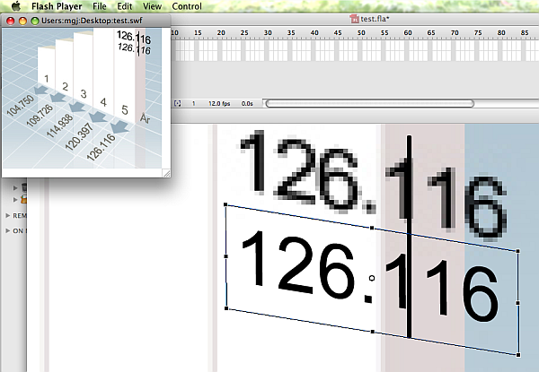
“This may mislead viewers into thinking that the screenshots are more polished than they look, whilst the information on the screenshot can remain unreadable.”
That about wraps up our article round-up of overused design elements. We hope you found it enlightening, and that we have managed to do our part in making the web a better and prettier place.
Do not forget to check out the full articles by clicking on the links provided, and also do not forget to leave us your thoughts in the comment section below.
Leave a Reply