10 Websites using Fullscreen Menus
“If you have a business website, make it stickier; redo the merchandising often and try new things until you hit the right homepage… then try and beat that. The most important audience drivers on the Internet are paid search and key word optimization. Concentrate on those. They are very inexpensive compared to banner advertising.”
– Lynda Resnick
We live in the information age. People are no longer content with short, catchy phrases that describe a product or service. They want transparency; they want to know everything that there is to know, they want you to make the information available to them, and they want it presented to them just as neatly as you would have done if it were a slogan. And more power to them, I say!
Websites are one of the great game changers in the world of marketing and advertisement, making the two truly interactive by giving audiences a more hands-on approach to commercials. That means that having a website that really catches the eyes of users can prove to be a definite advantage.
This “arm’s race” for well designed and developed websites have brought on some wonderful advances in both design and technology, like parallax scrolling and one page websites, and today we will be taking a look at some of our favourite websites using fullscreen menus.
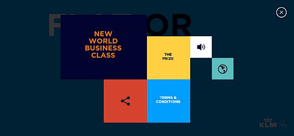
1. KLM – Flat or Not
KLM’s little contest to promote their new Business Class seats benefits from a absolutely wonderful website, from several aspects.
One of these aspects is, of course, the fullscreen menu you get, which gives you the information you might want about what the website is, terms and conditions, and all that. A really cool wink from the designers is that the menu is made using flat design. So some definite brownie points there.
2. Curadmir
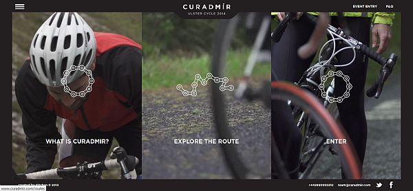
Curadmir is a cycling event from the British Isles, and the website promoting is boasts a truly gorgeous design that also makes the website easy to navigate. You get all the information you might need in three sections, all of which can be easily found from the start page.
3. Huge
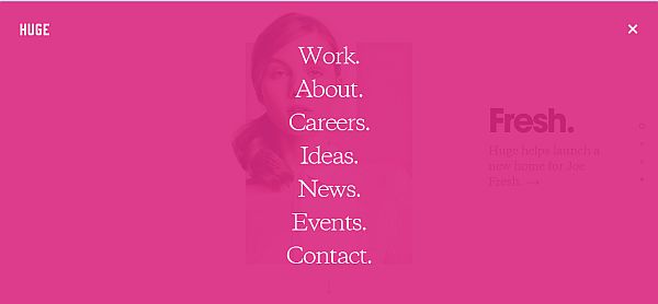
Huge is a design agency, so their website had to be especially good, as it is, in a way, the very first pitch you might be making to a potential client.
Great choice of colors and a modern feel are the main attractions of this website, but the menu is the real star here, in my opinion. Taking a cue from the company’s name, the menu covers the entirety of the screen in a slightly transparent pink, and allows you to visit any sections of the website quickly from there, without having to scroll down.
4. Pho Vietnam

When you are a restaurant owner, there are two ways your customers could get lost: one is on their way to your restaurant, and the other is browsing your website. The first is a bit more difficult to avoid, but the second can be solved by great design.
Pho Vientam’s website is a master-class of intuitive user experience design, making navigation extremely simple with its large sections and fluid running.
5. Threadslike
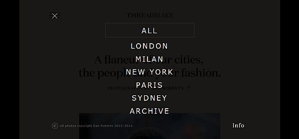
Like Huge before, Threadslike’s website menu is fullscreen covering the screen in an even more transparent black, this time, and allowing you to navigate the sections through there. This really is a great menu solution for any single scroll website.
6. Domna Krasina
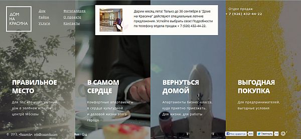
I will be self-referential again, and say that Domna Krasina is a lot like Pho Vietnam.
The menu has animated GIFs this time around, that much is true, making it just that little bit more eye-catching. I will admit I cannot read Cyrillic, so I did kind of get lost on the website, but that is only because of the language barrier.
7. Ready Set Rocket
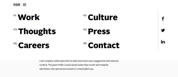
Ready Set Rocket’s menu drops down lightly as a feather, revealing the websites sections. Clicking on one takes you there smoothly, and you also still have the menu button, so you can quickly get from anywhere to anywhere.
8. SIFA Events
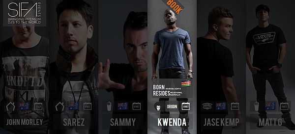
SIFA Events, as you could probably already tell, are event organizers of the musical persuasion. Their page elegantly presents available entertainers in a row, arranged in vertical stripes that highlight once you hover over them. Within the stripes you have the information you need about each of them, namely when they are available, what they, and where they reside.
9. Tictail
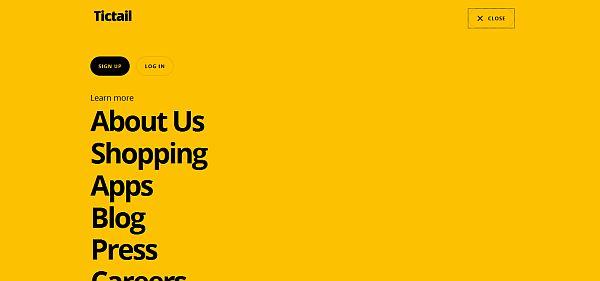
Personally, I like Tictail’s menu screen more than I like the website itself. The background color works well with the color of the font, it runs absolutely smooth, and you can easily access all of the site’s sections from here.
10. AltSpace
AltSpace’s search button also double as a menu button. Once you click it, the main screen is covered by a transparent black filter, and from there you can either type what you are looking for, or filter the main page’s content by clicking one of the buttons above.
That wraps up our list of 10 websites using fullscreen menus. We hope that you enjoyed studying the items on our list, and that they have provided you with a bit of design inspiration.
We also hope that you liked our article enough to leave us your thoughts, so do not forget to go down to the comment section, and leave us a few nice and encouraging words to read.
Leave a Reply