Typography Trend: The Art of Calligraffiti
“Somehow I started introducing writing into my drawings, and after a time, the language took over and I started getting very involved with the handwriting and then the look of the handwriting.” – Patti Smith
Calligraphy is just as much a part of human evolution as the development of language. The two are virtually inseparable, as the earliest surviving written texts are all done in calligraphy.
The word calligraphy comes from the Ancient Greek words kallos and graphẽ, the two meaning beauty and writing, respectively. That does not, however, mean that calligraphy is strictly a Western tradition.
Calligraphy differs from continent to continent, and even from region to region, within the continents. Non-European cultures with important calligraphic traditions include Thailand, Nepal, India, China and Persia.
What calligraphy is, essentially, is the art of writing, or better yet, lettering. It makes the letters themselves works of art, as opposed to just the text.
We’ve already discussed graffiti and street art in another article, and it’s these three art forms that blend together to create Calligraffiti.
Calligraffiti is the brain-child of Niels Shoe Meulman (or Shoe, for short). Shoe has been tagging since 1979, and is a graffiti legend since he was 18 years old. Together with Bondo from Paris and Mode2 from London, he formed the graff crew Crime Time Kings, and started putting Europe on the map for its graffiti.
Not just a graffiti artist, Niels also took an apprenticeship under Dutch graphic designer Anthon Beeke, from 1989 to 1992. After his apprenticeship, he started his own design company, called Caufield & Tensing, together with Michael Schaeffer. The company is later bought by FHV BBDO, which appoints Meulman as senior art director.
He left the company in 2001, and became a partner at Unruly. It is during this time that he started working for big names, such as Umbro, WAVE Magazine, and Link Magazine.
2004 say him heading over to Los Angeles, and organizing lectures and workshops at UCLA. During this time, he also became a professor at Rietveld Academie, and in 2006 at Academie voor Bouwkunst.
He launched Calligraffiti in 2007, with a solo exhibition of the same name, in Amsterdam. The exhibition was hugely successful, which lead to his works being showcased at many international exhibitions in Europe and North America, and in 2010, the book Calligraffiti – The Graphic Art of Niels Shoe Meulman was published by From Here to Fame Publishing in Berlin.
The book contains a collection of his works, as well as a preface from ambigram artist John Langdon, who states: “You are as good as me. Only I did more.”
Now, the moment you’ve all been waiting for: let’s take a look at Shoe’s marvelous Calligraffiti.
Unism
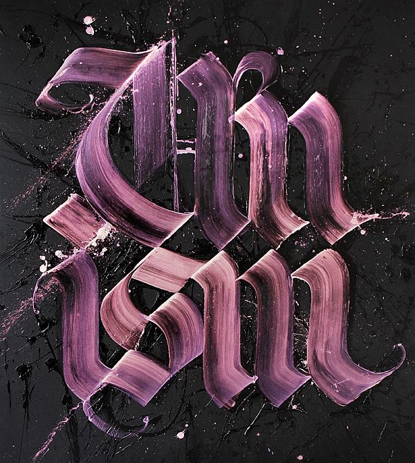
Taken from the collection of the same name, Unism’s whole gimmick is adding “un” to a base-word. In an interview for White Walls, where he is asked about his playing with words, the artist states: “There are no words. There are no images. Only everything in between. There is no truth, only opinions. It all swings and roundabouts. The abstraction in my work isn’t only visual, the words themselves also tickle the imagination.”
Unknowledge
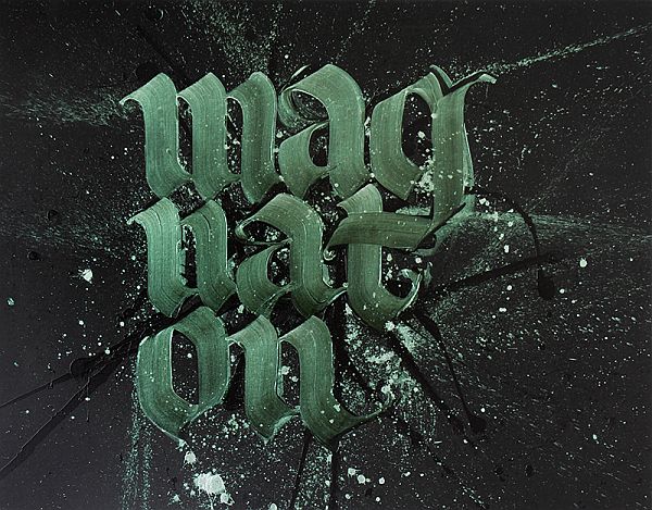
Accompanied by a quote from Albert Einstein that reads: “Imagination is more important than knowledge. For knowledge is limited to all we now know and understand, while imagination embraces the entire world, and all there ever will be to know and understand.”, this works is about the importance of imagination over knowledge.
It’s through imagination and curiosity that knowledge is attained. Furthermore, knowledge without imagination is pure limitation.
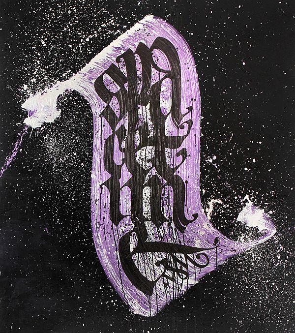
Unidentical
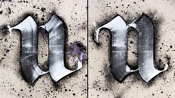
A diptych is an object with two flat plates attached at a hinge. Diptychs are most commonly used for religious purposes, either as icons or as lists of people, living and departed, that a church commemorates.
Here, the artists two different “n” letters, that look different, but are still the same letter. This could, perhaps, be a commentary on how all religions are, essentially, the same, with the only real difference between them being merely “esthetic”.
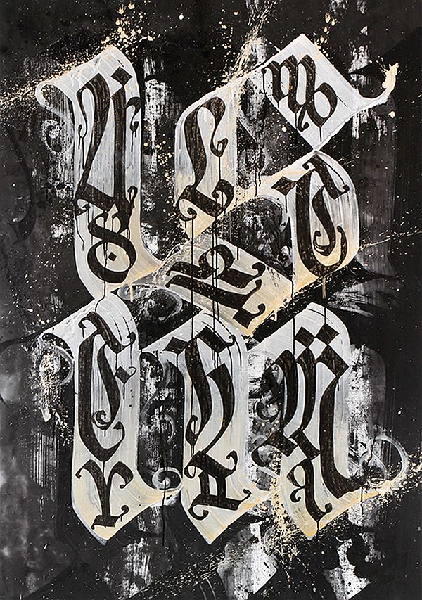
Spacetime
Clearly a fan of both science and art, Shoe created this stunner using acrylic and pearlescent paint on linen. The chaotic strokes make the painting really dynamic, and in combination with the almost Gothic letters and the scroll that they are written on, give it an almost aged feel. We think that this work is also inspired by Einstein, and his theory on the space-time continuum.
Pearlesque Shoe
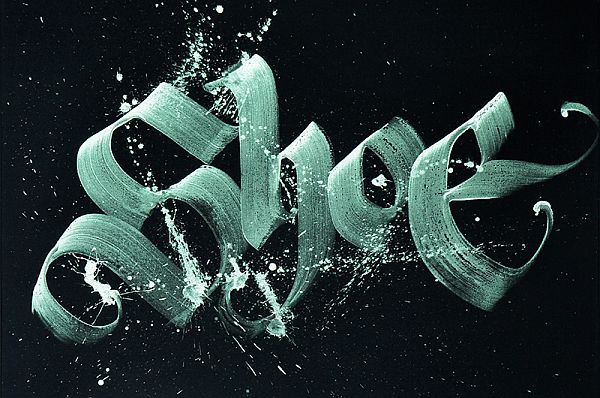
A classic-looking, tag-like painting, this Calligraffiti obviously shows the graffiti side of Niels’s art. It looks very much like a classic tag, only it’s done by painting on canvas, rather than being spray-painted on a wall. A homage to the artist’s urban roots.
Alchemism
Creating words is an intricate part of Meulman’s art, as it is a testament to his deep rooted love for creativity and imagination. Here, he replaces the correct word, alchemy, with the made up (but correct sounding) alchemism.
The objective of alchemy, among others, is creating the elixir of life, which confers youth and longevity. You could say that youth is imagination, and longevity is artistic creation.
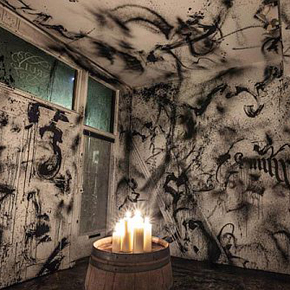
Ununiverse
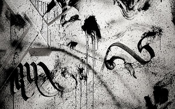
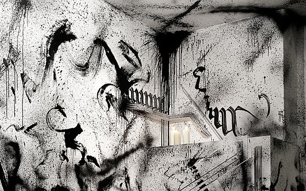
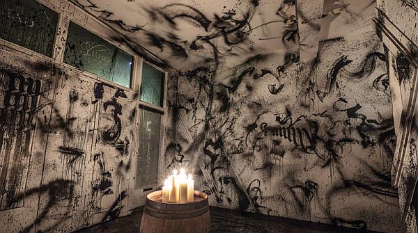
Ununiverse is an art installation that Niels did with Matthew Skjonsberg at the Unruly Gallery. The installation’s theme is the winter solstice, and is a further statement to the artist’s favoring of imagination over knowledge.
Focusing on the ritualistic side of the winter solstice, the whole thing feels like a blend between urban and pagan, with the white walls being covered in black smudges and gothic letters making it look like a graffiti crew’s “hangout”, and the candles and barrel giving it a medieval atmosphere. It makes you think “What if superstitions were as important now as they were in the Middle Ages?”
Drunken Shoe
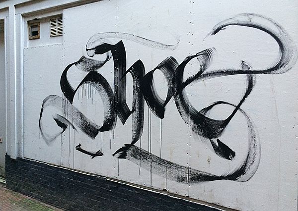
Never forget your roots. Much like our previous entry Pearlesque Shoe, Drunken Shoe showcases the artists love for graffiti, only this time in a much more “orthodox” way. Using paint, shoe tagged his name on wall, for old times sake.
My Balls and My Word
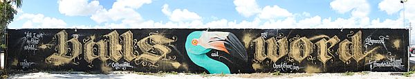

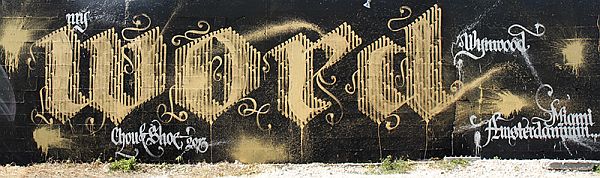
Done with Adele Renault in the Wynwood district in Miami, during Shoe’s third visit to Art Basel Miami in 2013, this mural is a famous quote from the movie Scarface. The quote was chosen because, in the movie, the action takes place in, you guessed it, Miami.
That concludes our article on Niels Shoe Meulman’s Calligraffiti. We hope you enjoyed looking at the pictures, as much as we enjoyed collecting them.
If you want to see more Niels’ Calligraffiti, be sure to check out his website, here, and don’t forget to give us your thoughts, in the comment section below.
Good strategy, but I think that most of these are meant for really well-tailored projects.
shoe forgets that words have meaning, which is the antithesis of what a calligrapher is supposed to do: illuminate knowledge by means of aesthetics, and illuminate aesthetics by means of knowledge. he sets an example and standard for the form based in ignorance and flashiness, which is what the world needs the least of these days. also he can’t line up his negative spaces for jack. that aside, he’s a big inspiration.