Design Evolution of Official Wimbledon Programmes
Here is one of the few effective keys to the design problem – the ability of the designer to recognize as many of the constraints possible – his willingness and enthusiasm for working within these constraints. Constraints of price, of size, of strength, of balance, of surface, of time and so forth.
– Charles Eames
Wimbledon, The Championships, The Wimbledon Championships is the oldest tennis tournament, dating from 1877, and is considered worldwide as being the most prestigious of its kind. It is a part of the four Grand Slam tennis tournaments, along with the Australian Open, The French Open ( Roland Garros) and the US Open.
Wimbledon is the only tournament that is played on grass, after the Australian Open changed to hard court in 1988. It was founded by the All England Lawn Tennis and Croquet Club, who was a private club, back in 1877. It was originally called Sphairistike. And design has been a part of this superb sport since its founding.
Its programme has changed significantly since its beginning, and we are here to show you how much design has changed over the past 126 years.
1. 1887
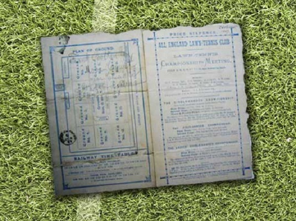
The first programme was designed for Wimbledon’s 10th birthday. The design was simplistic, as printing technology was still at its incipient stages. They used white card stock, and they printed a blue text over it, with crude illustrations used to describe the sport. It cost about sixpence back then, and we can round it up to 28.8p, or 0.49$ to nowadays.
In 1887, the tournament was held from July 2ndto July 7th. Lottie Dod won the ladies single at the young age of 15. 15 years old and 285 days to be more exact. And she become the youngest Wimbledon women’s single champion.
2. 1894
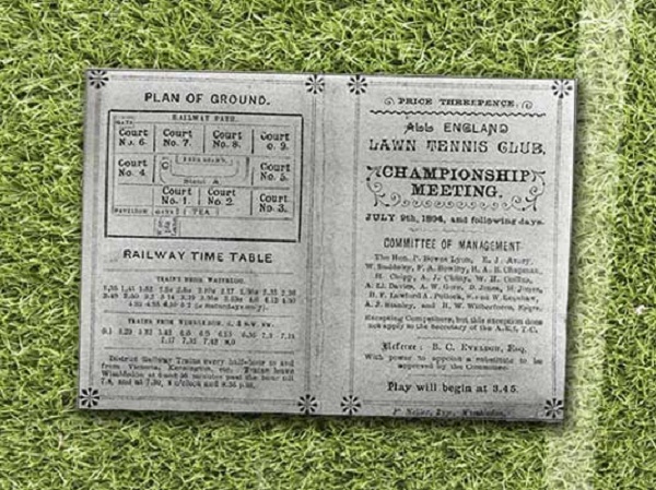
From 1887 to 1894 the programme remained just about the same, in 1894 it suffered minor changes. You can see the typeset varying from serif, sans serif, and a sort of calligraphy style font, but nothing much. Borders and page separators have been used more on the pages, to attract the eyes to certain details.
It cost about three pence, which we can round up today to 14.4p or 0.24$. This time the tournament was held from July the 9th to July 18thand Joshua Pim was crowned champion after defeating his colleague Wilfred Baddeley.
3. 1909
As we entered the 20th century, the programme was changing slightly, but still no major changes. It was still simple, but now it used a monochrome design, with borders used as decorations, and with some typesets.
This time, the Wimbledon was held from June 21st to July 3rd and Arthur Gore defeated his fellow compatriot Josiah Ritchie, and won the men’s single final.
4. 1922
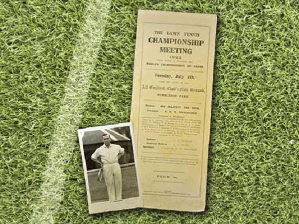
As you can clearly see the programme hasn’t suffered any major changes whatsoever, but the game added some new rules. It was the first tournament where all the defending champions were required to play in the main draw.
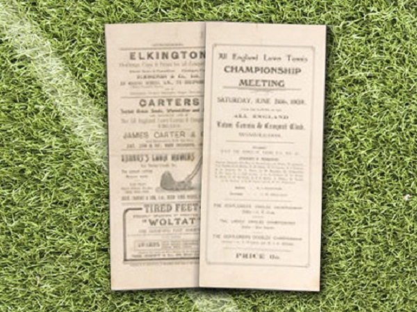
5. 1932
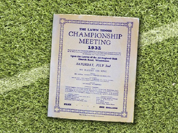
After years of having the same design, the programme experienced some big changes. It used a solid blue color scheme throughout its layout, and it was somehow returning to its roots – scheme wise it was the same as the 1877 one. It seems that it was going to evolve into a little magazine. The price gone up, costing one shilling, meaning 57.7p or 0.98$ in todays currency.
6. 1948
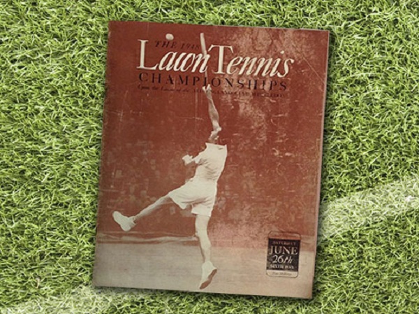
This time, the programme suffered an incredible change. It was the first time a photograph was portrayed on the front cover of the programme. The 1948 tournament was held from June 21st to July 2nd and it was the 62nd Wimbledon Championships event.
7. 1952
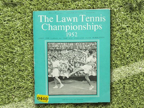
As printing technology advanced, the use of photographs were constantly being used as front covers. They remained monochrome because of the high cost, although the programme tried to introduce live and vibrant colors in its design.
Mainly blocks of colors. Calligraphy fonts were getting unpopular, and the sans serif font was used. In 1952 the tournament was held from June 23rd to July 4th. It lasted one week and four days.
8. 1969 and 1974
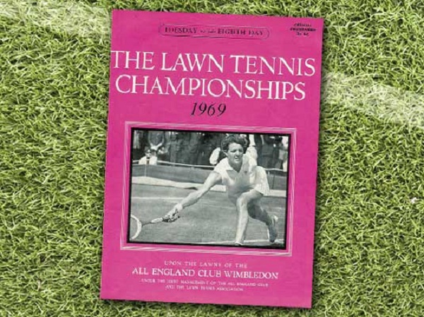
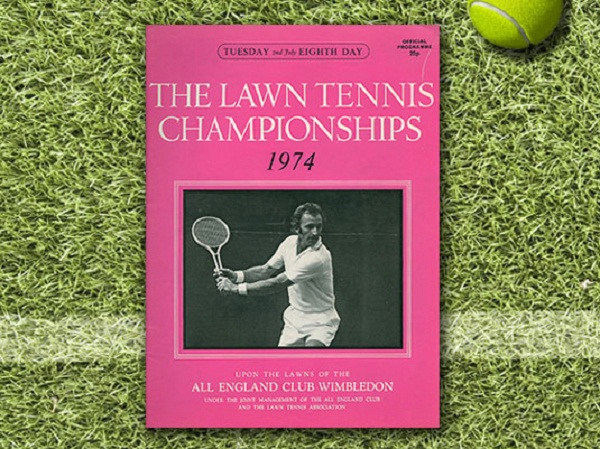
The programme remained kind of the same as the one used in 1952. You can see how the colors have been changed to be more vibrant and expressing the joy of the sport. Photographs were also used as front covers.
The programme was going through changes, minor changes for font styles and sizes, but not too much. In 1969 the tournament was held from June 23rd to July the 5th. The 1974 tournament was held from June 24th to July 6th and it was the 88th staging of the Wimbledon Championships.
9. 1983
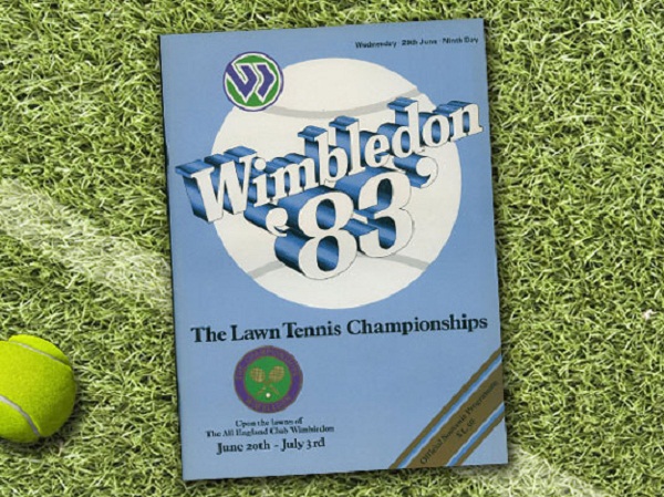
The year 1983 came with a big change for the programme. The photograph was removed from the front cover, and instead they used for the first time a 3D text. The 19- prefix was also removed. The tournament ranged from June 20th to July 3rd.
10. 1990
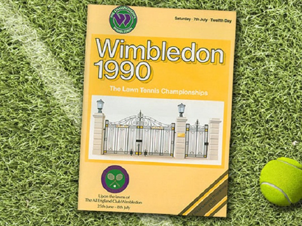
Technology advanced, and the prices were lowered, so the programme withstand new changes. On the front there were used more colored illustrations, depicting the gates of the Lawn Courts at Wimbledon.
11. 2007
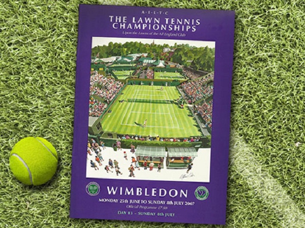
In the new era, in 2007, the programme was going through major changes. The event titles were shifted to other positions on the front cover, and large colorful illustrations appeared once again – this time of the center court, without the roof.
The tournament was held from June 25th to July 8th , and it was the first time in its history that the prizes were equally for both men and women. The final was the third longest final, and it was between Swiss player Roger Federer and Spanish player Rafael Nadal.
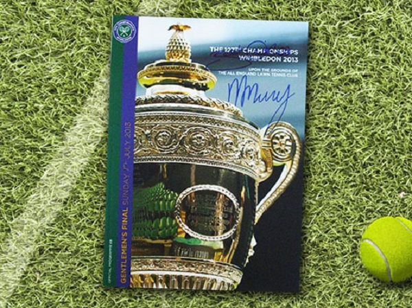
12. 2013
In 2013, the programme was yet again changed. The usage of block colors was not so dominant as in previous years. And a photograph of the cup was on the front cover. Andy Murray, a Scottish player, went on and won the trophy that year.
Dear readers, we would love to hear your opinions, your thoughts. Has the programme evolved accordingly or did you imagined another pathway for it? Are you up for the challenge of designing, just for fun, a programme? Post your designs, your thoughts in the comment section below. We can’t wait to see and hear them out.
I like this very much.