Design for Emotion: How to Create a Connection with Users
“Red is such an interesting color to correlate with emotion, because it’s on both ends of the spectrum. On one end you have happiness, falling in love, infatuation with someone, passion, all that. On the other end, you’ve got obsession, jealousy, danger, fear, anger and frustration.”
– Taylor Swift
Emotions are powerful things. They are swift (exactly why we chose a Taylor Swift quote) and intense, and they lead to long-lasting, stable feelings towards a product. But how do you use emotions to create a connection with users?
Fact of the matter is that it is pretty much impossible to be 100 percent sure will have the desired effect on users. That does not, however, mean that you can not plan as best you can. After all, web design is a thing that people do (you included), so it has to work at some level.
To answer this conundrum as best we can, we put on our explorer hats, and set of on journey through the internet, looking for knowledge, or at least a few tips.
Today, we will be synthesizing the information we got from two of the best articles on the subject (in our opinion), and we will, of course, provide you with links to them, if you want to go more in-depth.
Well then, let’s get started.
First up, we will talk about an article Carrie Cousins wrote for DesignShack. In it, she approaches the issue via the Wheel of Emotions, a concept developed by psychologist and educator Robert Plutchik in 1980.
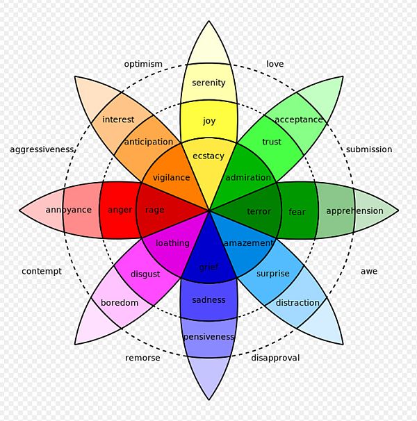
The wheel you have just seen is based on four basic emotions and their opposites, and -like we said in the opening paragraph- the emotion a user feels while interacting with you design leads to a corresponding feeling. It is this feeling that dictates any future interaction he or she has with your design.
The four basic feelings and opposites are: joy and sadness, trust and disgust, fear and anger, and surprise and anticipation. Now, it is not simply a question going for the positive feelings (in the case of fear and anger it is downright impossible), but rather a question of going for the correct feeling.
Sure, in most cases, as a designer, you will want to go for the positive feeling, because it is all too likely that you are advertising a product. In some cases, however, you are probably going for the negative, like for example if you are raising awareness about social injustice or illegal whale hunting.
Carrie describes the uses of each set of emotions as follows:
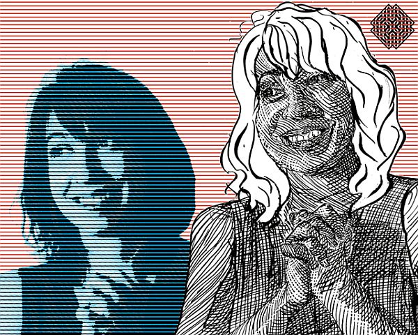
1. Joy and Sadness
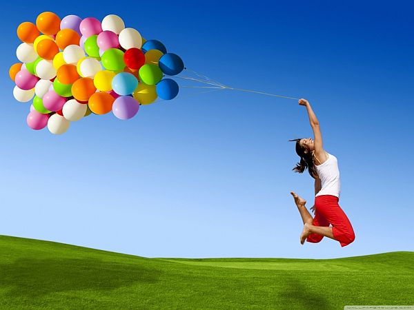
“Happiness is contagious. What that means for your design is that people will want to share it with others, on social media, person-to-person or in other ways. People connect with happy aesthetics in a way unlike many other options because it is something that makes them feel good with a positive emotional association.
Sad visuals connect with users in an almost similar way, surprisingly. Because sadness creates a sense of empathy, which most users will react to. They may trust the subject more or share what they’ve seen to help out.”
2. Trust and Disgust
“Trust and disgust go hand-in-hand and the line between the two can be crossed easily. You want to create a visual that seems real and believable for users to find it relatable. But this does not mean it can’t be fantastical. It just needs a hint of trustworthiness.
Without that trustworthiness, the emotional connection to trust can turn to disgust quickly. This can make it difficult for users to relate to your message or connect to the visuals you have presented.”
3. Fear and Anger

“Using fear or anger in design can be one of the trickier emotions to work with. For some people the emotional response to fear is to run away – you don’t want this happening when people see your design. But for others fear, makes a person more secure in their present situation, maybe even better connecting him or her to the information you are presenting.
Anger and negativity have a lasting effect. These visual emotional cues to lead to aggression or stubbornness and have an overall unpredictable nature when it comes to predicting how angry or negative images will impact someone.”
4. Surprise and Anticipation
“Surprise can entertain and help create a connection with a user. An interesting visual element or action can accomplish this. Surprise often comes with either fear or happiness to create an overall emotional association.
You’ve seen the ‘coming soon’ teasers. This draws on our sense of anticipation. Sparking the curiosity of people as to what comes next. A well-designed coming soon page, for example, will be remembered – and hopefully users will return multiple times – so they can find out what is coming or happening.”
Together with each set of emotions, she also gives an example in the form of a website, encouraging you to see what role the aesthetics play in creating which emotion, so we encourage you to go read the full article, and check out the websites. Also, the full article goes on to talk about concepts laid down by Aaron Walter and Donald Norman, respectively, so it really is an eye-opening read.
Starting from the premise that, without emotion, a website is lifeless, Charlie B. Johnson wrote an article for GraphicDesignBlog in which he explores the role that emotions play in design. Unlike Cousins, Charlie focuses on invoking positive emotions for marketing purposes, and states that “(…) you need to look at it from the users’ perspective”. In this case, it is much more important to try seeing your designs through a user’s eyes, rather than a designer’s.
According to his article, the three major emotions you need in design are:
5. Desire
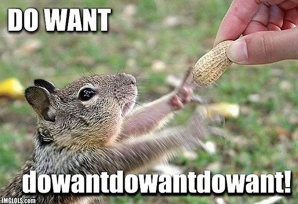
“One emotion that almost every company wants to evoke in its customers is that of “Desire”. The desire of having it; a desire to own the product! Take Apple, for example. Apple, in spite of creating exorbitant products has attained tremendous success over the years. Why? Simply because its products arouse a high level of desire among the people. They are presently the biggest fashion label in tech world.”
6. Happiness
“Websites that give a happy feeling overall are generally well-run. There are several ways you could instill a fresh, vibrant feeling in your graphics. You could use colors that reflect happiness, use content, make offers, show visuals that would help the reader forget all stress and simply smile.”
7. Thrill
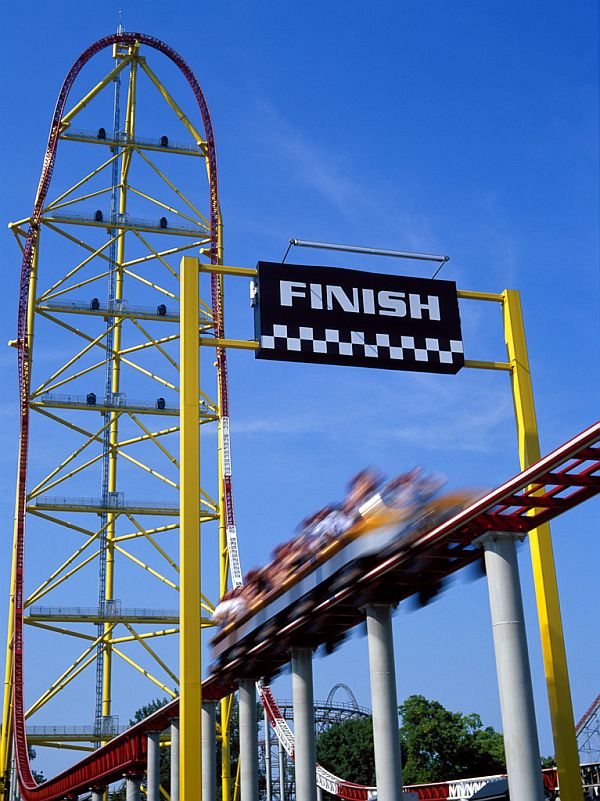
“Thrill is not essential for all great web design, but for many, it produces excellent results. Take Red Bull, for example. The graphics are awesomely exhilarating and communicate the brand’s message perfectly to its fans and customers. The vision and mission of this brand is to add spirit and energy in human life. It sponsors various athletes and sports events. You can see visual details of all the adrenaline pumping experiences taking place under the banner of this brand.”
That about wraps up our article on how to create a connection with users. We hope you found it useful, and that our little round-up will help you create designs that will instill loyalty in users. If you want more emotions in design, be sure to check out the links to the articles we have provided.
Also, don’t forget to share your thoughts in the comment section below.
Leave a Reply