Creative Typography in Web Design – Breaking the Rules
Typography is believed to date back to the 15th century, so it is as old as the earliest writing systems, but it sky rocketed in last couple of years, becoming an important element in website design and not only.
Although typography has developed since then in a specialized field, it’s only recent that creative users of typeface in web design were able to go beyond the limitations of their operating systems. Today, designers, with the help of the new and improved systems, get the chance to go further than the standard system fonts.

Before we talk about this important quality of typography in web design – creativity, I would like to go through a couple of reasons why typography plays a big role in web design and some basic short tips on choosing the right type for a website.
The Importance of Typography in Web Design
As Robert Bringhurst states in his book, “The Elements of Typographic Style“,
“Typography exists to honor content.”
Typography is very important in visual communication – it is one of the elements that plays a huge role in the perception, quality and usability of a website design. It’s an integral part of web design that shouldn’t be taken for granted at any cost because the correct use of typography has the power of creating or breaking the whole feel of the web design.

Although excellent typography can be defined as attractive but at the same time completely functional, the real beauty of typography is that it creates a communication bridge with the visitors, providing them with the information they came to the website for. So it’s just not all about graphics – although it plays an important role in web design – it’s also about implementing the right typography in order to create effective results.
Choosing the right type, although it depends mostly on the designer, is essential because it is in a close relationship with the services or the products being marketed and with the message the website is trying to send.

Using a professional type in your design will create the perspective of a more legible and organized website.
Making use of creative fonts and styles will most certainly help get some attention and position in the mind of the users with the impression of a unique website.

The aesthetics of your web design must go hand in hand with its functionality so be careful how you approach typefaces in your design because it may diminish or it can enhance the visual impact of the website. So remember, looks are as important as functionality!
Tips to Consider When Using Typefaces
Limit the number of fonts you use – It’s not a good idea to use too many fonts throughout your website – you can try to make some small adjustments to the existing font or only use two types of font. This helps maintaining a sense of continuity in your design.
Choose the right size for your fonts – The size of the fonts must be in correlation to the theme and the style of the website design – note that some typefaces are designed to be used as small fonts and they don’t have the same effect if they are too big. Moreover, take in consideration that the text size on your website should be readable on different browsers and technologies.

Make your typography legible – When designing a website, you must have the user in mind, after all, the website’s purpose is to communicate information. Your goal is to encourage people to go through the information on your website with ease.

Choose wisely the color of your text – the color of the text must be chosen according to the color of the overall design. Remember that the color of the text shouldn’t overwhelm your design and, on the other hand, it shouldn’t be consumed by it.

Spacing for more readability – make sure you edit effectively the text by giving it line spacing/leading because the placement of space between the words can impact the readability of the copy.

Apply Font-Smoothing – Consider that many of your users may have a windows operating system lower than Vista and that means that it does not apply “font-smoothing” as a default setting. This is important because it can really make a difference on how the viewers see your text.
Creative Typography in Web Design
Although I’ve stated above a series of tips on how to choose the appropriate typography for your website, there are always some exceptions. There is always someone who bends the rules, who wants to be unique, creative or out of the box.

We all know that there is a list of the most used fonts in web design and you can find information all over the web about these “safe” fonts. The most beautiful part about web design nowadays is that you have the chance of personalizing your website design, making it fit your needs – starting with its design and the typography used.

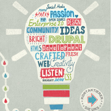
A mix of vividly created graphics or images and typography has the power of taking web design to the highest level of attractiveness and creativity.

Some of the most creative website designs are the ones of graphic designers, illustrators or other types of creatives. The thing is that creative people like to use various techniques to establish themselves as creative voices on their websites – and that seems natural.

That’s why, creative web designs will most often include hand-drawn illustrations, personalized fonts, organic shapes, full bold colors and other unique elements of design – all destined to leave you with a strong impression of creativity.

The only thing to add here is that the custom handwritten font must be restricted to only a few key areas of text. If you set all of your content in your personalized handwritten font, you may affect the readability of your content. The purpose is to create a design which combines illustrations and typography that will send a message – the message intended by the artist. And that message should reach you, the viewer, and it should give you the sense of high creative energy.

Just think that each one of the elements used contributes to the impact the design has on the viewer’s perception. For example, the colors you use in your design always influences the way people interpret something and the typeface you use brings a meaning to the design through its style, weight, connotation and context.

Nevertheless, it’s not that easy to create a new font type that is decorative, unique and in the same time practical. A creative font used in your design can give the feeling of the website and an insight to the designer’s style or the personality of the owner. It certainly adds character to the website and it can help create a theme for the website – so nothing must be done random, every element of the web design should work in harmony to create one great symphony of meaning.

And although creative fonts have the power to compliment the design and the content of the website, they can also be used too much and can even become annoying or at least distracting – that’s why you should restrict the use of these type of fonts to a maximum of 3 in your design.

Big Typography
Although web design trends are shifting from year to year and it’s overwhelmed with ideas, big typography remains a trend preferred by web designers throughout the last couple of years. The important thing about big typography is that, when used correctly, it helps visitors to pay attention to the part where you want them to focus.

Big typography will also place emphasis on the hierarchy of the content – there will be a visual contrast between it and the smaller text around it.

Remember that words are one of the most powerful elements you creatives work with – sometimes they are even stronger than the color or imagery. Words can implant information in ones mind, they can create mental pictures and ideas. As a designer, you have the great task of shaping those words to achieve the greatest possible effect.
Your turn now
I gave you only a few examples of creative typography in website designs. Do you know other web designs with creative typography? Please share them with us.
Thanks for sharing your post…Typography has developed since then in a specialized field, it’s only recent that creative users of typeface in web design were able to go beyond the limitations of their operating systems. Today, designers, with the help of the new and improved systems, get the chance to go further than the standard system fonts.
Understanding a font’s language, the feelings and the message it transmits is probably the most difficult encounter when designing the perfect website.
But when done right, with the perfect size and tonal value, it will sing and stand on its own. In other words, choosing the type for a website is like writing poetry.
Thanks for this article, I enjoyed it.
Thank you for sharing your information with us. I find your posts a valuable resource in my profession. I enjoy sharing ideas with others to help them grow their craft.
Typography fascinates me.
Thank you again for sharing. I will be a return visitor to your blog. :)
These are great collections. Some of the designs I just like for their vintage effect. They just fascinate me in anyway and those typography are just excellent. Thank you for sharing this and be visiting soon.
Great post!
I love typography, so I am very happy that online typography is getting better!
Considering that the printed press is getting less popular every day, the importance of web typography has grown. We can’t just make informative websites with default fonts anymore, we need truly awesome online typographical solutions, and today’s technologies let us to do so, which is great news :)
I love the development of type over the years, especially how it’s become such a front-runner in the web design world. Now it’s not graphics in web design, it’s the font graphics. Love the examples.
It would be interesting to look at type on websites and how it’s changed as well. I remember when the most simple type was used as a header of a page. Now if the page is boring, people won’t read id. Type in general has made so many advancements and I agree with Julia that the printed medium is getting smaller so finding a way to display artistic typography for the web is the way to go.