Concept Redesign of WhatsApp for iOS8
“At WhatsApp, our engineers spend all their time fixing bugs, adding new features and ironing out all the little intricacies in our task of bringing rich, affordable, reliable messaging to every phone in the world. That’s our product, and that’s our passion.”
– Jan Koum
WhatsApp is the ground-breaking messenger app that quickly replaced the SMS as the go-to method of mobile text communication. It was released in 2009 as an App Store exclusive, and in only two short years became one of the top 20 apps in the U.S. App Store.
By 2010 WhatsApp became available for BlackBerry smartphones, Symbian, and Android Devices, and in 2011 it also became available for Windows Phones, making it a truly cross-platform app.
Currently, the app is owned by Facebook, and although you might think all that financial power would have brought the app even more popularity, things seem to have slowed down. For me, at least.
Admittedly, I have stopped using the app a while back, but I’ve been noticing that people around me also are not really using it much anymore, preferring to use either Facebook Messenger or Viber, and perhaps the user interface has a lot to do with (Oh, how I miss Google Talk!).
One of the really great things you can do as a designer is take a look at an app, and really just sit down and create the new UI you would like it to have. That has to be up there with changing your own spark-plug, and making your own furniture, in terms of cool DIY
One designer from Kiev has done just that.
Dmitriy Haraberush went about creating a new UI for WhatsApp, revamping everything from the Profile, to the Status, and I have to say I could see myself using the App again.
He underwent this task after seeing that he stopped using it because all his friends and contacts moved to Viber:
“I’ve decided to make a redesign of WhatsApp messenger after I started noticing, that i stopped using it. Not that i wouldn’t want to, but after the latest Viber redesign implements, all my friends and contacts went there.”
Inspired by the most recent version of WhatsApp, Dmitriy’s UI looks absolutely gorgeous and fresh, while keeping the essence of WhatsApp intact, since it is, after all, a part of the apps brand identity:
“I’ve tried to make it as more close to the recent version as i could, so that wouldn’t be another concept, but the production instead.”
Let’s take a look at what Dmitriy has done.
1. Profile
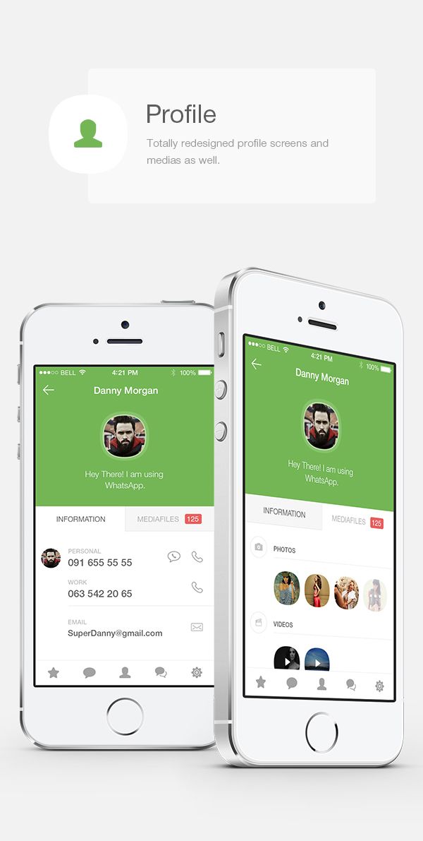
Now that’s more like it! The profile screen boasts a nice flat design, the classic white and green color scheme looks right, and lets you instantly know that you are, in fact, using WhatsApp, and its made in such a way that using it is completely intuitive.
2. Favorites
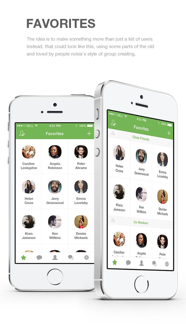
Like he says himself, the Favorites screen is inspired by “Nokia’s style of group creating”. Once again, it looks absolutely gorgeous, and does not seem to be the kind of redesign that will take the user a long time to familiarize with. Also, you can split your favorites into several sub-groups, which is extremely useful.
3. Chat Screens
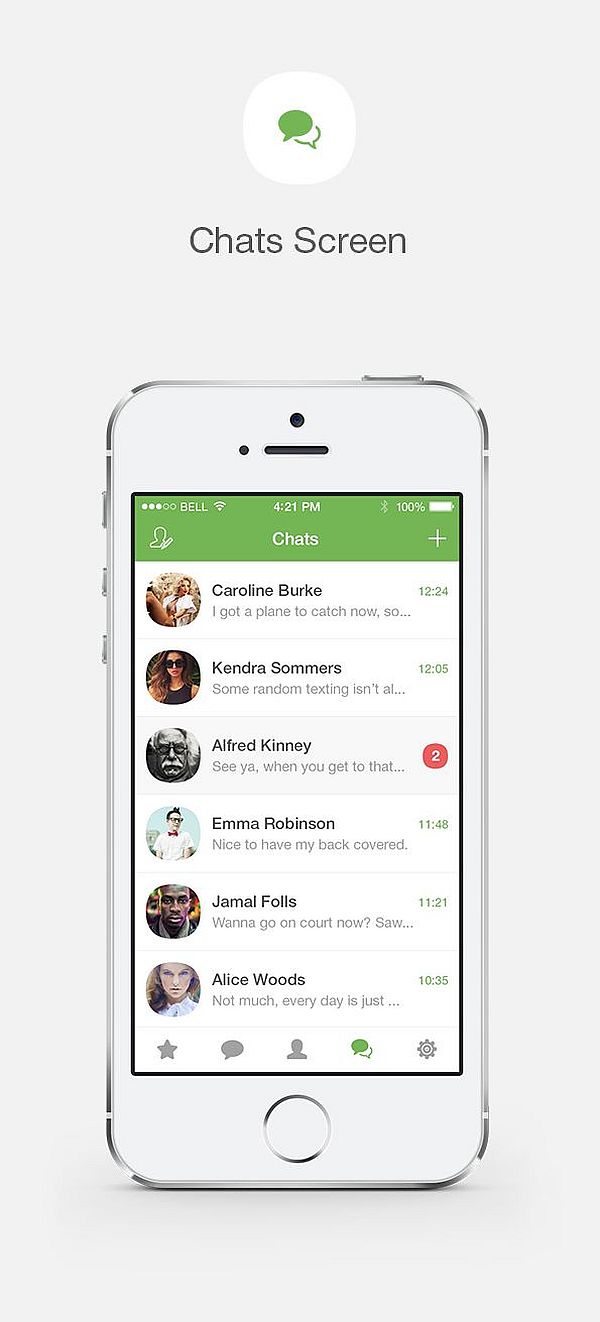
The Chat screen is one of the two most important parts of a messenger app. If you fail at this one, you better make one incredible messaging screen. Dmitriy pulled of the Chat screen just fine, though, making it simple, clean, and intuitive. Also, Emma Robinson looks like a small child.
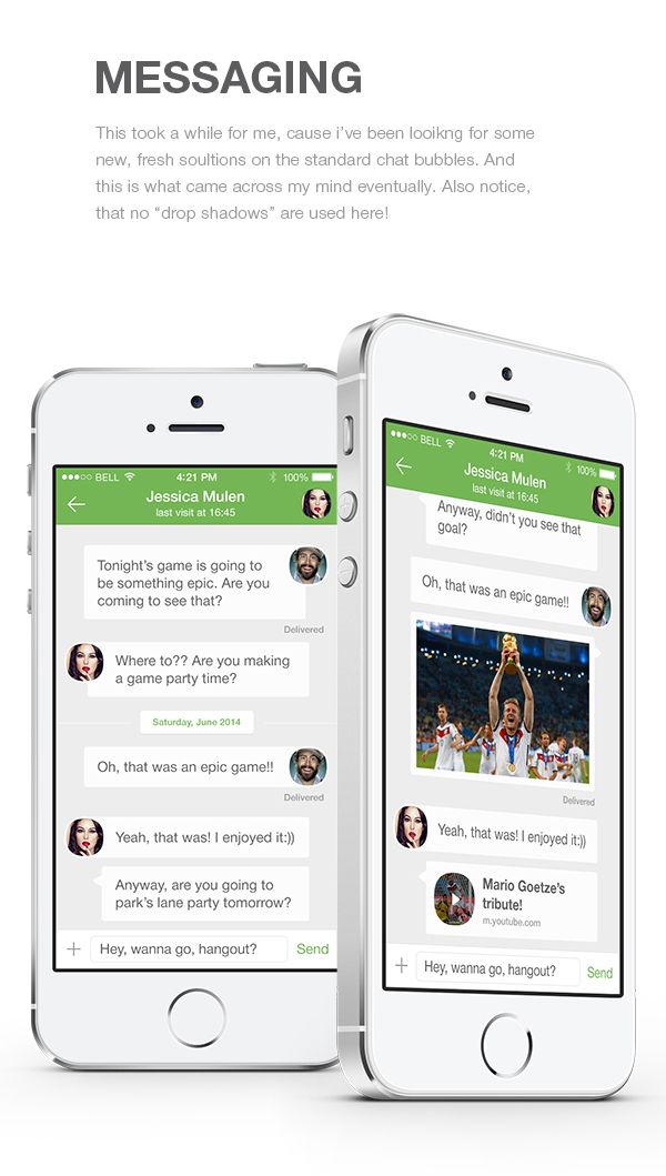
4. Messaging
I really like how, if the text is short, the round profile picture looks like it is inside the chat bubble. The overall design is nice and flat, and yes, we did notice that they no drop shadows, which we also find a cool feature, especially since it probably helps the app run better.
5. Calls
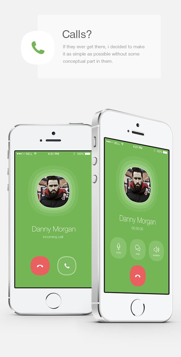
I don’t know many people that actually used the Call function of the app, but in my experience from the last time I tried using it, it did not go all that well. I’ll be the first to admit that the phone I was running the app one was not really cutting-edge, but cluttering up the screen with all those buttons and the message box once the other person answered was cruel.
None of that in this design, however. Simple, minimalistic buttons on a plain green background, with the profile picture of the person you are calling, in the middle. Looks great!
6. Status
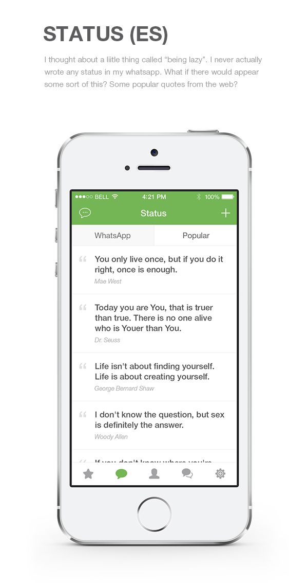
What a cool little feature! The designer openly admits that he never wrote statuses, just using the predefined ones, so he came up with this little ditty: taking popular quotes from the web, and adding them to predefined statuses collection. My hat well and truly off to him because this is one absolutely fantastic idea.
Well, that concludes our presentation of Dmitriy’s concept redesign of WhatsApp for iOS8. We hope it’s given you a bit of design inspiration, and that it will make you take a closer look at your favorite (or least favorite) apps, and see what you would change.
If you want to see more of Dmitriy’s work, go on and check out his Behance profile. Also, don’t forget to leave us your thoughts, in the comment section below.
Leave a Reply