15 Inspiring Websites with Minimalistic Color Schemes
“That’s been one of my mantras – focus and simplicity. Simple can be harder than complex: You have to work hard to get your thinking clean to make it simple. But it’s worth it in the end because once you get there, you can move mountains.” – Steve Jobs
“Less is more” might sound like a cliché, but it is hard not to argue that it is true. Just think of the old Greek marble statues. The great attention to detail, the smoothness, and the simple elegance that comes with them being just plain white.
Now, believe it or not, those marvelous statues used to be colored. And we are not talking about a pinch of black here, a smudge of blue there. No, we are talking about brightly colored with pale pink, bright yellow, and other colors you might usually see on a not so tasteful porcelain figurine.
History did not like the color of the statues, so it slowly peeled it away, leaving the marble wonders we know today. Now that we have presented that quite interesting fact to you, let us get down to business.
You are here to get some design inspiration, so we have prepared a list of 15 websites that use minimalistic color schemes. This list should help you get on your way to mastering minimalism, so history won’t have to perform retouches on your work.
You’re a designer, so you know that white and black aren’t colors. They’re neutrals. So the rules for this list is that, aside from neutrals, the websites can only use up to three colors.
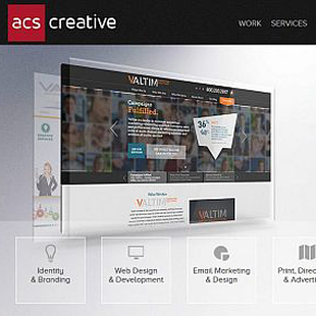
1. ACS Creative

Red is the ultimate eye catcher. Psychologists are still disputing why exactly red attracts so much attention, but the fact of the matter is that red is the color of passion and danger. The way they use it here, not overwhelming the neutrals, gives the impression of a serious, but passionate, creative team.
2. Frieze Magazine
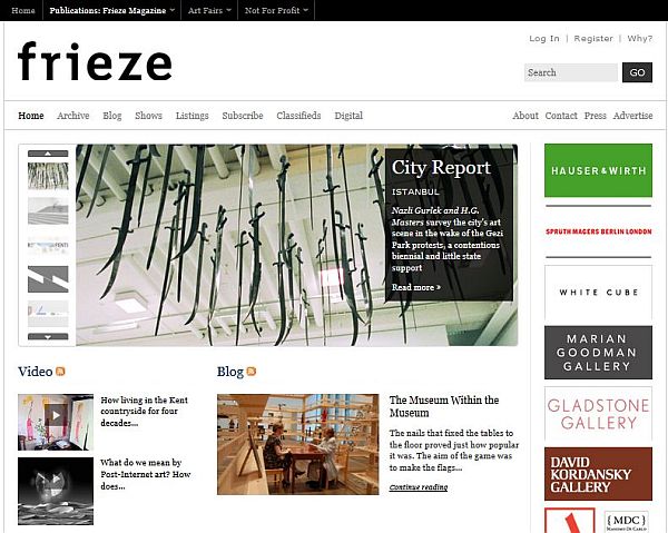
We forgot to mention that there is no lower limit to how many colors a website can use. This one, for example, uses none, and it’s all the better for it. Lots of white, black text, and the classic orange RSS feed buttons. It’s about the stories, not about the look.
The headlines are the ones meant to grab your attention, and the design is there like a nice, serviceable tray to bring you the articles.
3. nclud
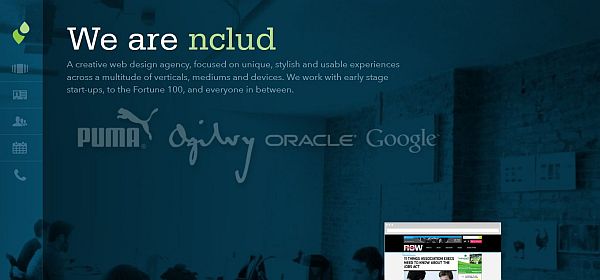
You wouldn’t think that blue text on blue background would work, but they pulled it off. The company’s name is written with a bright, almost fluorescent green, and that instantly gets your attention, making you also look at their impressive roster of clients.
4. Pixelbot
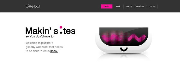
This is an example how you can use lots of colors, while still staying minimalistic. You’re greeted by a very vibrant violet. Then, as you browse the site, you come in to contact with two shades of orange, fluorescent pale green, and pale blue, depending on which section of the site you go to.
They pull this off by not putting a lot of either color, and never mixing them together on the same page.
5. David Airey
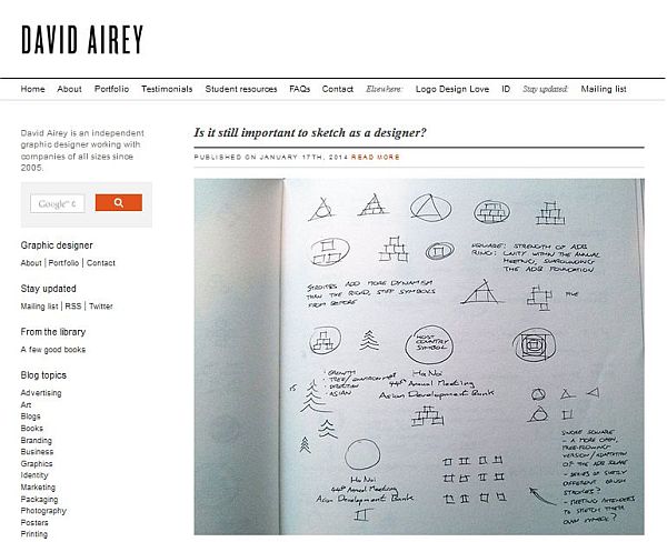
The only dash of color you’ll see on this website is the bright orange search button, to help you find any specific things on the website. The rest is white with black text, and even the black isn’t all that prevalent, except for the logo at the upper right corner, letting you focus on the designs the website is showcasing.
6. Eightface
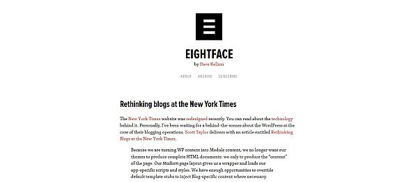
Here you have a real “how to” of minimalist web design. The only color actually used here is orange, and even that is just used for hyperlinks in the text. This makes the blog extremely readable, while also encouraging you to research topics even deeper by pressing the orange hyperlinks, of which there seems to be plenty.
This is a great example of minimalist functionality, since having all those hyperlinks and a complex design would’ve made the sight unappealing.
7. The Deck
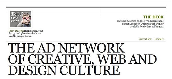
Toad green links, white background, black text. Once again, this lets you focus on the reading, and does away with any unnecessary animations or images.
8. Fellswoop
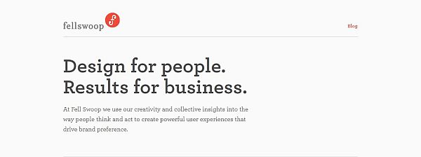
Blogs are meant to be read. As such, Fellswoop just kept their logo real small and discreet next to the logo. Their name is written with gray, while the content is written with dark-gray. This is a lot easier on the eyes (especially at night, with the screen blasting bright white light in your face), and allows you to spend more time actually browsing the blog.
9. Jon Tangerine
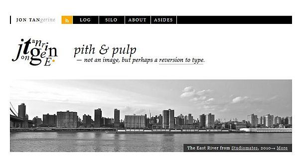
There’s a lot of orange going around, and there’s a good reason for it. Orange is a happy color, but not aggressively happy. That’s why you can use it in any way you like, either a lot, or you could just put a bit orange here and there.
Eightface uses it for hyperlinks, Jon Tan’s website uses it to highlight text you hover over with you cursor, and for a little dot at the end of the website’s logo, making it looks serious and whimsical all in the same time.
10. Yuna
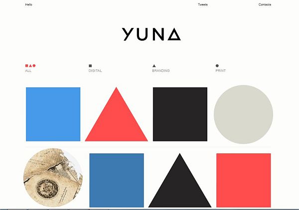
This could just as easily be an online portfolio and a modern painting. You certainly wouldn’t be surprised to see this in an art gallery. This is one of the few websites that uses pink correctly, opting for a pleasant pink, that many people might confuse with red, or perhaps orange. Blue is also used, coloring the squares, and highlighting the websites three subcategories.
11. Martin Hipp
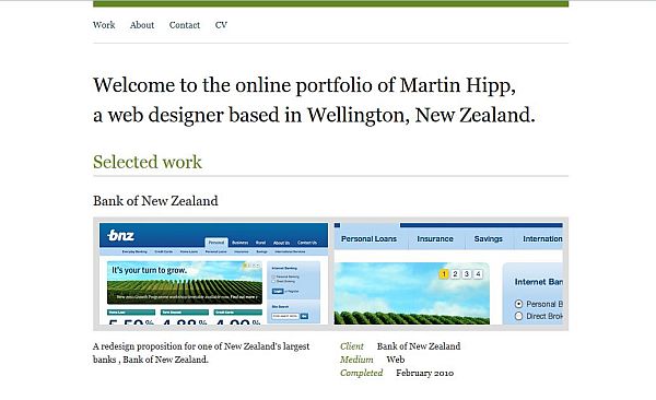
You’ve probably noticed green seems to be one of those colors that just keeps popping up. That’s because green is a relaxing and refreshing color, and on Martin Hipp’s website it’s used in exactly that way. He keeps his site short and concise, and adding the green almost makes browsing it seem like taking a break from whatever it is you were doing.
12. Olex
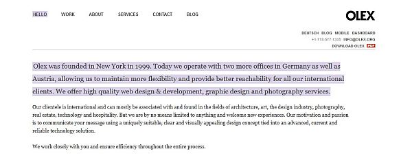
Here’s a color you don’t see too often, It’s called African violet, and it is simply superb. It’s used here to highlight both content and for highlighting clickable text when you hover over it. Other colors used are pale orange and gray-blue for marking highlighted and respectively new content.
13. Site Inspire
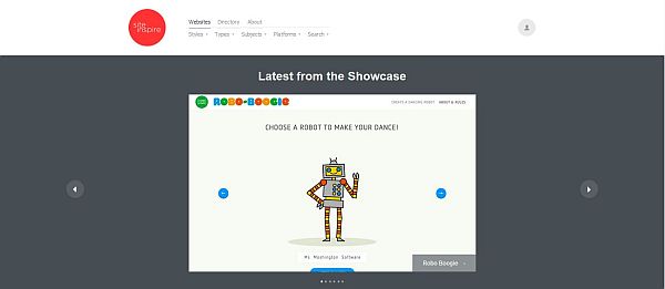
If you look up simplicity in the dictionary, you will find this website. The bright red logo captures your attention, and after that the showcases do the rest. They smartly chose two shades of gray for the background, instead of the classic black and white, which makes the website much more easier on the eye.
14. Image Mechanics
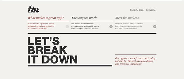
With a grain colored background, black text, and a really pretty shade of red used for highlighting, Image Mechanics really hit a home run as far as design is concerned. Like the entry above, their choice of background color doesn’t tire the eyes as much as a white background would, and the particular shade of red goes really well with the background, while still attracting attention to highlighted text.
15. The Loft

White with black text when they want you to focus on the text, and making a photo seem as if you’re looking at it through a black-tinted window when the text isn’t quite as important. Any other color just comes from the photos themselves, but even the photos are mostly black and white. This is the very essence of minimalism, right here. It’s got style, it’s totally modern, and it looks gorgeous.
And that concludes our list of 15 websites with minimalistic color schemes. We hope they’ll inspire you to create your own minimalistic masterpiece. Share any minimalistic websites you like with us in the comment section.
Leave a Reply